

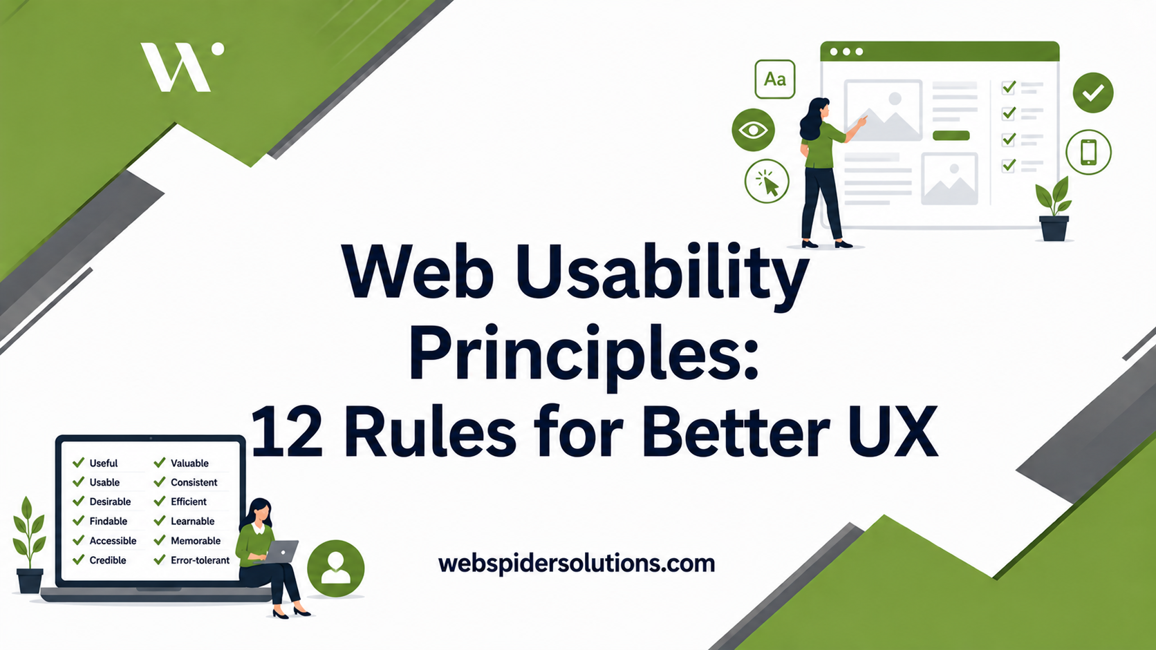


TL;DR:
- Most websites fail due to unnoticed friction during development, leading to user abandonment and decreased conversions. Applying core usability principles like visual hierarchy, clear CTAs, and accessibility ensures better user experience and legal compliance. Continuous testing and iteration are essential for transforming usability frameworks into measurable, real-world results.
Getting users to stay, click, and convert is harder than it looks. Most sites fail not because of missing features but because of friction nobody noticed during the build. 88% of consumers won’t return after a bad experience, and a single second of extra load time cuts conversions by 7%. Web usability principles give designers, UX researchers, and digital marketers a proven framework to eliminate that friction before it costs you. What follows is a practical breakdown of 12 core principles you can apply today.
Table of Contents
- Key takeaways
- 1. Visual hierarchy guides every user decision
- 2. Apply Hick’s Law to reduce decision fatigue
- 3. Use white space to create cognitive breathing room
- 4. Balance composition using the Rule of Thirds
- 5. Color contrast and CTAs need to earn their position
- 6. Typography shapes readability and scan patterns
- 7. Responsive design with mobile-first thinking
- 8. Core Web Vitals and performance benchmarks
- 9. WCAG compliance is no longer optional
- 10. Effective navigation design reduces friction
- 11. Consistency and design systems build user confidence
- 12. Conversion-focused content and CTA clarity
- Quick reference: 12 principles at a glance
- What years of watching sites succeed and fail taught me
- How Webspidersolutions can turn these principles into results
- FAQ
Key takeaways
| Point | Details |
|---|---|
| Usability drives revenue | Poor experience drives users away permanently; applying core principles directly protects conversion rates. |
| Cognitive load must be managed | Limiting choices, using white space, and applying visual hierarchy reduce decision fatigue for users. |
| Accessibility is legally urgent | Nearly 95% of home pages fail WCAG standards, and lawsuits exceeded 4,000 in 2024 alone. |
| Consistency builds trust | Design systems and repeated interaction patterns help users develop accurate mental models of your site. |
| Testing is never optional | Effective UX is iterative. Automated scans miss roughly 70% of real accessibility issues. |
1. Visual hierarchy guides every user decision
Visual hierarchy uses size, contrast, and positioning to direct where users look and in what order. When you place the most important element largest and highest on the page, users process it first without thinking about it.
Most users scan web pages in an F or Z pattern, not a top-to-bottom read. The F pattern shows up on text-heavy pages: users read across the top, scan left, and trail off. The Z pattern appears on landing pages with less copy, where the eye moves from top-left to top-right, then diagonally down. Designing with these patterns in mind means placing CTAs, headlines, and key value props exactly where the eye already goes.
Pro Tip: Place your primary CTA in the top-right position on landing pages to intercept the Z-pattern before the eye drifts away.
2. Apply Hick’s Law to reduce decision fatigue
More choices slow decision-making and reduce task completion rates. Hick’s Law is simple: the time it takes to decide increases logarithmically with the number of options available.

You see this play out constantly in navigation menus. A top-nav with 10 items overwhelms; one with five focused items converts. The same principle applies to form fields, pricing tiers, product filters, and even button labels. Every extra option you add is a micro-tax on the user’s attention. Applying Hick’s Law means auditing every screen for unnecessary options and ruthlessly removing what does not serve the user’s primary goal at that moment.
3. Use white space to create cognitive breathing room
White space does not mean wasted space. It is the intentional absence of content that gives the eye a place to rest and the brain a moment to process what it just absorbed.
Dense pages trigger a cognitive stress response. Users perceive them as difficult and often leave before reading anything. Generous padding around text blocks, clear separation between sections, and breathing room inside cards all signal professionalism and ease. Apple’s product pages are the standard reference here: minimal elements, abundant white space, and a single message per scroll section. The discipline is in what you leave out.
4. Balance composition using the Rule of Thirds
Think of your screen divided into a 3×3 grid. Placing key elements at the intersections of those grid lines creates natural visual tension that feels balanced without being symmetric. This concept, borrowed from photography and applied to user experience design, keeps layouts from feeling flat or center-heavy.
A symmetric layout can feel static and corporate. An asymmetric layout that follows compositional rules feels dynamic while staying organized. For web design, this means offsetting hero images against headline text, letting supporting copy breathe on one side while the visual anchors the other. Balance is not about equal weight. It is about deliberate distribution.
5. Color contrast and CTAs need to earn their position
Color is not decoration. It is a functional signal. When your primary CTA blends into the background or matches a secondary element, users miss it. When it stands out through contrast and strategic placement, click-through rates rise.
The practical rules here:
- Maintain a minimum 4.5:1 contrast ratio for body text against its background (WCAG AA standard)
- Reserve your brand’s most saturated or vibrant color for primary actions only
- Avoid using color alone to convey meaning since colorblind users represent roughly 8% of men
Poor contrast is one of the most common website accessibility standards violations, and it is also one of the easiest to fix with a tool like WebAIM’s Contrast Checker.
6. Typography shapes readability and scan patterns
Most users do not read web pages word by word. They scan for anchors: headings, bold text, short paragraphs, and visual breaks. Typography choices determine how easy or hard that scanning becomes.
A few interface usability tips that hold across every project:
- Use a type scale with clear hierarchy (H1 much larger than body, body larger than captions)
- Keep line length between 50 and 75 characters per line for comfortable reading
- Maintain at least 1.5x line-height for body text to prevent crowding
- Avoid more than two typefaces per page to preserve visual coherence
The specific font matters less than the system you build around it. Clarity and consistency beat personality every time.
7. Responsive design with mobile-first thinking
Mobile traffic accounts for more than half of global web sessions, and designing for desktop first and adapting down creates interfaces that feel bolted together on smaller screens. Mobile-first design means starting with the smallest, most constrained context and adding complexity as screen size grows.
Mobile-friendly design requires thumb zone consideration: the areas of the screen a user’s thumb reaches comfortably while holding a phone in one hand. Interactive elements placed at the top corners or center of a tall screen create finger strain and errors. Primary actions belong in the lower-center zone where they are naturally reachable.
Responsive design also affects your SEO. Google uses mobile-first indexing, meaning your mobile experience is what gets crawled and ranked. For more on how responsive design affects conversions, the relationship between usability and search performance is more direct than most teams realize.
8. Core Web Vitals and performance benchmarks
Users form website impressions in as little as 50 milliseconds, and a load time increase from one second to three seconds boosts bounce rate by 32%. Speed is not a technical nice-to-have. It is a usability principle with measurable business consequences.
Google’s Core Web Vitals break performance into three measurable signals:
- Largest Contentful Paint (LCP): How quickly the main content loads (target: under 2.5 seconds)
- Interaction to Next Paint (INP): How responsive the page is to user input (target: under 200 milliseconds)
- Cumulative Layout Shift (CLS): How much content shifts unexpectedly during load (target: under 0.1)
Each metric maps directly to a user frustration. Slow LCP means users wait and leave. High INP means clicks feel broken. High CLS means users misclick on elements that moved. Monitoring these via Google Search Console costs nothing and reveals real friction fast.
Pro Tip: Run your pages through PageSpeed Insights monthly. Even a well-optimized site can degrade as third-party scripts accumulate.
9. WCAG compliance is no longer optional
Nearly 95% of home pages have detectable WCAG failures, and with compliance deadlines tightening in 2026 and 2027, the legal exposure is real. More than 4,000 accessibility-related lawsuits were filed in 2024 alone.
WCAG 2.1 and 2.2 organize requirements into four principles: Perceivable, Operable, Understandable, and Robust. Common failure points include missing alt text on images, form fields without proper labels, keyboard traps, and insufficient color contrast. Automated WCAG tools catch only around 30% of issues, which means automated scans are the starting point, not the finish line. Manual testing with screen readers and keyboard-only navigation is where real accessibility barriers get found.
10. Effective navigation design reduces friction
Navigation is where most users form their first impression of whether a site makes sense. When users cannot find what they need within two to three clicks, they leave. Clean, predictable navigation prevents that.
The principles that hold across every site type:
- Keep top-level navigation to five or six items maximum
- Use descriptive labels over clever ones (“Pricing” beats “Plans & Investment”)
- Place secondary navigation, filters, and utilities where users expect them by convention
- Include breadcrumbs on content-heavy sites so users always know where they are
Effective navigation design is not about being creative with menus. It is about building a mental map users can follow without thinking.
11. Consistency and design systems build user confidence
When buttons look like buttons, links behave like links, and error messages always appear in the same location, users develop accurate mental models of your interface. They stop thinking about the interface and start thinking about their goal.
68% of large companies use design systems to enforce this consistency at scale. A design system is not just a style guide. It is a living library of components, patterns, and rules that makes inconsistency structurally hard. For smaller teams, even a basic component library in Figma achieves the same effect. Consistency reduces cognitive load; it is that direct.
12. Conversion-focused content and CTA clarity
The best usability in the world fails if the copy does not clearly tell users what to do next. Conversion-focused content aligns what the user wants with what the business needs, and it does so without manipulation.
Clear CTAs follow a simple formula: specific verb plus the user’s benefit. “Start your free trial” outperforms “Submit” every time. Microcopy around forms and CTAs, the small text that reassures, clarifies, or reduces anxiety, has a disproportionate impact on completion rates. Optimized UX can increase conversions by up to 400%, and most of that gain comes from copy and clarity, not visual redesigns.
Quick reference: 12 principles at a glance
| Principle | Focus area | Key benefit | Common challenge |
|---|---|---|---|
| Visual hierarchy | Layout and attention | Natural focus flow | Overloaded pages dilute priority |
| Hick’s Law | Choice architecture | Faster decisions | Teams want to show everything |
| White space | Cognitive ease | Reduces overwhelm | Pressure to fill empty space |
| Rule of Thirds | Composition | Dynamic, balanced layouts | Overuse of centered symmetry |
| Color contrast | Accessibility and CTAs | Guides action, meets standards | Brand color conflicts |
| Typography | Readability | Better scanning and retention | Too many font weights or sizes |
| Responsive design | Mobile usability | Serves majority device users | Desktop-first assumptions |
| Core Web Vitals | Performance | Lower bounce rate, better SEO | Third-party script bloat |
| WCAG compliance | Accessibility | Legal protection, wider reach | Automated tools miss 70% of issues |
| Navigation design | Findability | Reduced friction | Overloaded menus |
| Consistency | Trust and mental models | Lower cognitive load | Siloed design across teams |
| Conversion content | Action clarity | Higher completion rates | Generic or vague CTA copy |
What years of watching sites succeed and fail taught me
I have reviewed hundreds of sites built by smart, talented people who still got usability wrong, not because they ignored the principles but because they misunderstood what the principles are for.
The biggest misconception I see is treating usability principles as a checklist. Teams tick off “we have white space” or “we added alt text” and move on. But usability is a measure of how well a real user, in a real context, accomplishes a real goal. The principles are a starting point for asking the right questions, not a substitution for watching actual users interact with your site.
I have seen beautifully consistent design systems produce terrible experiences because nobody tested with the actual user base. I have also seen scrappy, imperfect sites convert at remarkable rates because the copy was clear and the navigation was predictable. Effective UX design is iterative and ongoing, not a project you close out.
My honest take: the teams that consistently build usable sites are not the ones with the most design talent. They are the ones with the most curiosity about their users and the discipline to test, measure, and adjust. The principles give you the vocabulary. The testing gives you the truth.
— webspider
How Webspidersolutions can turn these principles into results
Understanding web usability principles is the first step. Applying them systematically across a live site, under real traffic conditions, with real business goals attached, is where most teams need a partner. Webspidersolutions works with web designers, UX teams, and digital marketers to translate usability frameworks into measurable outcomes. From conversion rate audits that pinpoint where users drop off, to website design best practices built for higher conversions, the team brings both the technical depth and the marketing perspective the work requires. If you want a structured starting point, a digital marketing audit from Webspidersolutions maps your current usability gaps against your growth goals. Book a free consultation to see where your site stands.
FAQ
What are the most important web usability principles?
Visual hierarchy, Hick’s Law, responsive design, and WCAG accessibility compliance are among the most impactful. These address cognitive load, device compatibility, legal requirements, and user attention in ways that directly affect retention and conversion.
How do web usability principles affect SEO?
Core Web Vitals, mobile usability, and accessibility compliance all influence Google’s ranking signals. A site that loads slowly or fails WCAG standards will underperform in search regardless of how strong its content is.
How many accessibility lawsuits were filed in 2024?
More than 4,000 web accessibility lawsuits were filed in 2024, and compliance deadlines under ADA and EAA are tightening further into 2026 and 2027, making WCAG compliance a legal priority for any public-facing site.
Can automated tools handle WCAG compliance testing?
No. Automated tools catch only around 30% of WCAG issues. Manual testing with screen readers, keyboard-only navigation, and real assistive technology is required to surface the accessibility barriers that automated scans miss.
What is the fastest way to improve website usability?
Start with a usability audit focused on navigation clarity, page speed, and CTA copy. These three areas produce the highest return for the lowest redesign effort and directly affect online user engagement and conversion rates.