


Most American businesses underestimate how much a clearly defined goal can impact the outcome of a responsive website project. In a digital world where more than 60 percent of website traffic now comes from mobile devices, having a site that adapts seamlessly is more than a technical requirement. This guide will show you how to break down the responsive website development process, helping you set smart objectives and choose the right experts to bring your vision to life.
Table of Contents
- Step 1: Define Goals For Responsive Website Development
- Step 2: Research And Shortlist Suitable Development Companies
- Step 3: Assess Portfolios And Technical Expertise
- Step 4: Communicate Requirements And Set Expectations
- Step 5: Test And Review Deliverables For Responsiveness
Quick Summary
| Key Point | Explanation |
|---|---|
| 1. Define Clear Goals | Establish specific objectives to guide responsive design, focusing on user experience and business needs. |
| 2. Research Potential Partners | Evaluate website development companies based on their experience, adaptability, and technical skills in responsive web design. |
| 3. Assess Portfolios Thoroughly | Examine past projects to determine a company’s ability to create adaptable and user-centric websites effectively. |
| 4. Communicate Requirements Clearly | Prepare a detailed project brief that aligns your website vision with the technical capabilities of the development team. |
| 5. Conduct Rigorous Testing | Validate responsive functionality across various devices, ensuring optimal performance and user experience at all stages. |
Step 1: Define goals for responsive website development
Establishing clear objectives is the critical first step in creating a successful responsive website. Your goals will serve as a strategic roadmap, guiding design decisions and ensuring your digital platform meets both user needs and business requirements.
To define meaningful goals, start by understanding your website’s core purpose. Are you aiming to generate leads, sell products, provide information, or build brand awareness? Responsive web design aims to create websites that adapt seamlessly to various devices, which means your goals should encompass user experience across smartphones, tablets, and desktop computers. Consider specific metrics like improved user engagement, reduced bounce rates, increased conversion rates, and enhanced mobile accessibility.
Practical goal setting involves breaking down broader objectives into measurable targets. For instance, instead of a vague goal like “improve mobile experience,” define precise outcomes such as “reduce mobile page load time by 40%” or “increase mobile conversion rates by 25%”. These specific benchmarks will help you track progress and validate your responsive design strategy. Remember that your website should deliver relevant, useful, and engaging content aligned with your organization’s mission, so ensure your goals reflect your brand’s unique value proposition and target audience needs.
As you move forward, your clearly defined goals will become the foundation for designing a responsive website that not only looks great but also performs exceptionally across all devices.
Step 2: Research and shortlist suitable development companies
Researching and selecting the right website development company is a critical process that will determine the success of your digital platform. Your goal is to find a partner who understands your specific needs and can translate your vision into a responsive, high-performing website.
Evaluating companies based on their adaptability to uncertain market conditions is crucial when choosing a development partner. Begin by creating a comprehensive evaluation framework that assesses potential companies across multiple dimensions. Look for firms with proven track records in responsive web design, examining their portfolio for projects similar to your requirements. Consider their technical expertise, understanding of user experience principles, and ability to create flexible designs that work seamlessly across different devices and screen sizes.
Dive deeper into each potential company’s background by examining their commitment to systematic innovation and technological adaptability. Request case studies, client testimonials, and examples of previous responsive web projects. Pay attention to their development processes, communication styles, and post launch support offerings. A great development company should not just build your website but act as a strategic partner who can guide you through the complex landscape of digital design and functionality. Create a shortlist of 3-5 companies that demonstrate strong technical skills, creative problem solving, and a deep understanding of responsive web design principles.
By methodically researching and evaluating potential development partners, you will increase your chances of finding a company that can transform your website vision into a robust and engaging digital experience.
Step 3: Assess portfolios and technical expertise
Carefully evaluating a website development company’s portfolio and technical skills is crucial to finding the right partner for your responsive website project. This step will help you understand their capabilities and determine if they can truly deliver the digital solution you need.

Assessing a company’s proficiency in implementing advanced responsive design techniques requires a comprehensive review of their existing work. Examine their portfolio closely, looking beyond surface level aesthetics to understand their approach to creating modular and adaptable web components. Pay attention to the diversity of projects they have completed and how effectively they have solved complex design challenges across different industries and platforms.
Understanding a company’s expertise in creating user centric designs that align with specific user goals is equally important. Request detailed case studies that demonstrate their ability to translate user behaviors and motivations into functional website designs. Look for evidence of their technical depth such as responsive grid systems, adaptive image techniques, flexible typography, and seamless cross device functionality. A top tier development company should be able to articulate how their technical solutions directly address user experience and business objectives. Ask specific questions about their development process, technologies they specialize in, and how they ensure optimal performance across various devices and screen sizes.
By meticulously reviewing their portfolio and technical capabilities, you will be well positioned to select a development partner who can transform your website vision into a sophisticated and user friendly digital experience.
Step 4: Communicate requirements and set expectations
Communicating your project requirements effectively is a critical step in ensuring a successful responsive website development partnership. Your goal is to create a clear, comprehensive roadmap that aligns your vision with the development company’s capabilities and approach.
Clear communication is fundamental to software development project success, so prepare a detailed brief that outlines your specific needs, goals, and expectations. Start by defining your target audience, desired website functionality, key performance indicators, and aesthetic preferences. Be as specific as possible about your technical requirements, including responsive design parameters, integration needs, content management system preferences, and any unique features your website must incorporate.
When establishing project requirements, focus on aligning your goals with the technical capabilities of potential web frameworks, ensuring a strategic match between your vision and technological implementation. Create a comprehensive document that includes visual references, wireframes, and mockups to help the development team understand your exact expectations. Schedule an in depth discovery meeting to discuss your requirements, allowing for collaborative input and clarification. During this meeting, encourage open dialogue about potential challenges, technical constraints, and innovative solutions that can enhance your website’s performance and user experience.
By investing time in clear, thorough communication, you will lay a strong foundation for a successful website development project that meets your business objectives and delivers exceptional digital results.
Step 5: Test and review deliverables for responsiveness
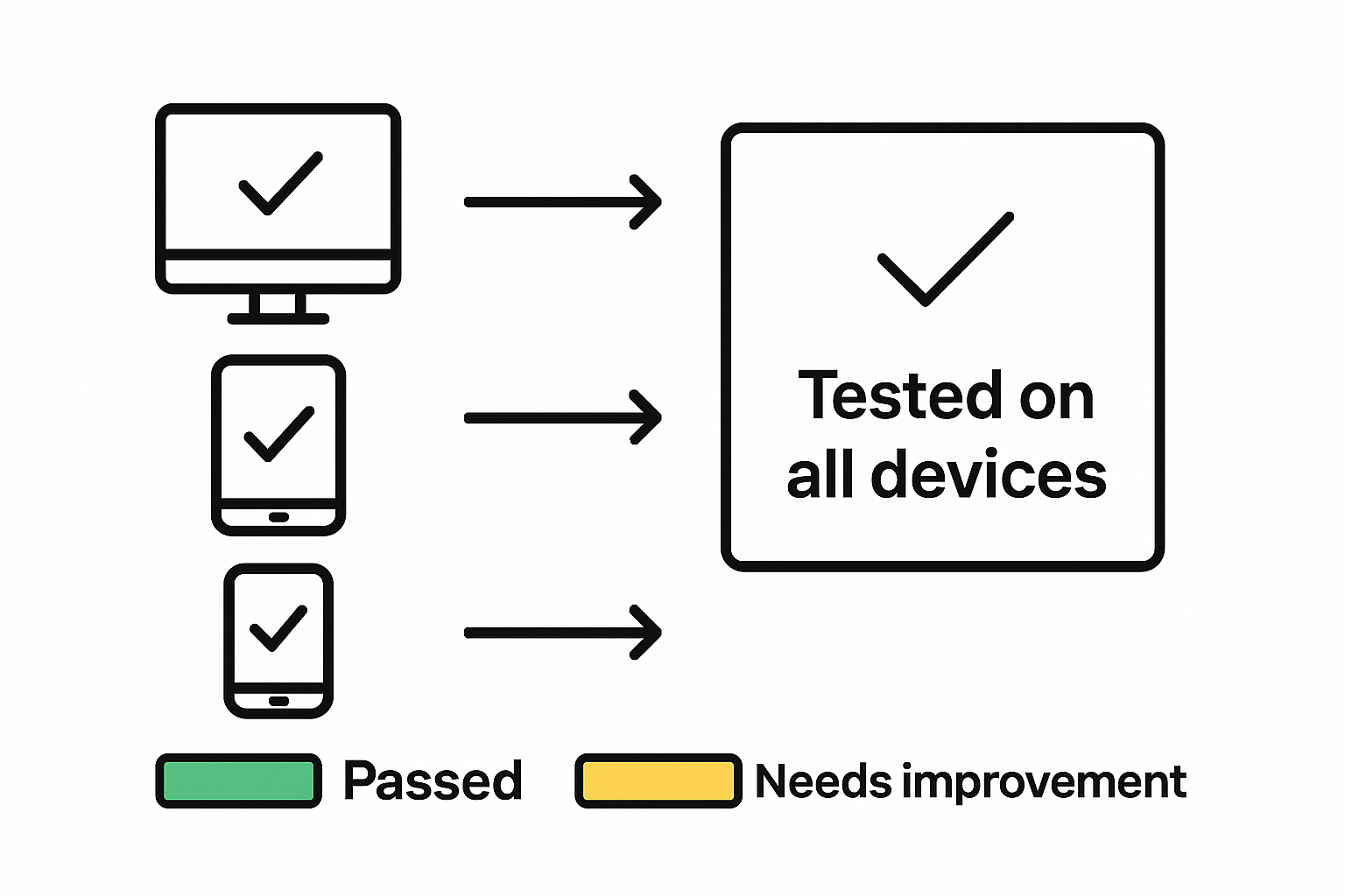
Testing and reviewing your website deliverables is a critical phase that ensures your responsive design meets the highest standards of performance and user experience. This step will help you systematically validate the website functionality across multiple devices and screen sizes.
Testing web pages across various devices and screen sizes is essential to ensure optimal rendering and usability, focusing on fluid grids, flexible images, and responsive media queries. Start by creating a comprehensive testing strategy that covers multiple device types including smartphones, tablets, laptops, and desktop computers. Utilize both manual and automated testing tools to evaluate how your website adapts to different screen resolutions and orientations. Pay close attention to layout consistency, image scaling, navigation menu behavior, and interactive elements that must function seamlessly across platforms.
Web usability testing is crucial for ensuring content accessibility and functionality across different platforms, so conduct thorough evaluations from multiple perspectives. Engage real users in your testing process to gain authentic insights into the user experience. Check for performance metrics such as load times, interactive response speeds, and visual coherence. Request your development team to provide detailed reports on how the website handles various technical scenarios, including slow internet connections, different browser versions, and accessibility requirements for users with disabilities. By meticulously reviewing these deliverables, you will ensure that your responsive website provides a consistently excellent experience for all users, regardless of their device or browsing context.
Unlock Your Website’s True Potential with Expert Responsive Development
Building a responsive website means facing challenges like ensuring seamless performance across devices, reducing bounce rates, and improving mobile accessibility. This article highlights the importance of clear goals, technical expertise, and rigorous testing to deliver a user-centered experience that drives results. If you struggle with translating your vision into a responsive, high-performing website that boosts engagement and conversions, you are not alone. Your business deserves a digital solution as adaptable and dynamic as your customers’ needs.
At Web Spider Solutions, we specialize in creating websites designed to excel on every screen. Our team focuses on responsive design principles that enhance usability, speed, and user experience while integrating your broader marketing goals. Looking to expand your reach through strategic paid campaigns that complement your site’s growth? Our expertise in Paid Advertising amplifies your visibility and drives targeted traffic with precision.
Ready to break free from performance bottlenecks and build a website that truly delivers? Explore our comprehensive digital marketing approach, including web design, SEO, and paid advertising, crafted to generate long-term growth. Start by contacting us at Web Spider Solutions for a consultation that will transform your responsive web development vision into reality.
Frequently Asked Questions
What are the primary goals when working with a responsive website development company?
To achieve the best results, clearly define your goals, such as improving user engagement or increasing conversion rates. Start by setting specific, measurable targets, like reducing mobile page load time by 40% within three months.
How can I assess the technical expertise of potential web development companies?
Evaluate their portfolios for projects similar to yours, focusing on their use of responsive design techniques. Request case studies and ask specific questions about how their technical solutions enhance user experience and meet business objectives.
How should I communicate my project requirements to a responsive website development company?
Prepare a detailed brief that outlines your audience, desired functionality, and aesthetic preferences. Use visual references like wireframes and mockups to clarify your expectations, ensuring both parties are aligned from the start.
What steps should I take to test my website for responsiveness after development?
Create a comprehensive testing strategy covering various devices and screen sizes. Utilize both manual and automated testing to check layout consistency and interactive elements, ensuring a seamless experience across all platforms.
How can I ensure that my responsive website meets accessibility standards?
Conduct usability testing with real users to gain insights into content accessibility. Ask your development team to provide reports on how the site handles different scenarios, including accessibility requirements, to make sure it serves all users effectively.
Recommended