


A homepage visitor reads about your SaaS platform, hesitates, then leaves without signing up. The missing piece is often a clear, effective call to action guiding their next step. For digital marketing managers, mastering the art of the call to action means bridging interest with commitment, turning passive clicks into real users. Discover how a strategic, actionable call to action can transform more visitors into conversions for your business.
Table of Contents
- Effective Call to Action Meaning and Purpose
- Types of Calls to Action for SaaS
- Design Elements That Drive Engagement
- Placement and Context Best Practices
- Optimizing CTAs and Avoiding Pitfalls
Key Takeaways
| Point | Details |
|---|---|
| Effective CTAs are Specific and Clear | A strong CTA directly states the action to take, such as ‘Start your free trial,’ reducing ambiguity for users. |
| CTAs Must Align with User Intent | Choose CTA types based on the user’s readiness; cold visitors need low-commitment options while warmer prospects can handle stronger asks. |
| Design Elements Impact Engagement | High contrast colors, strategic placement, and clear whitespace enhance CTA visibility and increase user engagement. |
| Continuous Testing is Essential | Regularly A/B test CTAs to refine messaging, placement, and design for optimal conversion rates. |
Effective Call to Action Meaning and Purpose
A call to action (CTA) is a direct request asking your audience to take a specific step. For SaaS companies, it’s the bridge between interest and commitment—the moment someone moves from thinking about your product to actually trying it.
Think of your homepage visitor who’s read three paragraphs about your platform. They’re interested. But without a clear CTA, they often leave without converting. A strong CTA tells them exactly what to do next.
What Makes a CTA Effective
Effective CTAs share five core characteristics:
- Specific: Clearly state the exact action (“Start your free trial” beats “Learn more”)
- Achievable: Make the ask realistic so users believe they can complete it
- Easy to follow: Remove friction—one click, one form, one clear path
- Normative: Align with what your audience expects and values
- Affirming: Reinforce positive identity (“Join thousands of data-driven marketers”)
Strategic prompts urging specific behavior work because they reduce ambiguity. Your visitor knows exactly what happens next.
Why Purpose Matters for SaaS
Your CTA’s purpose goes beyond asking for clicks. It communicates what value the user receives when they act. A CTA that says “Request a demo” implies you’ll spend 30 minutes learning how your product works.
However, many CTAs lack clarity about who should act and what concrete steps to take, which reduces effectiveness. Your SaaS CTA must answer two questions immediately: Who is this for? What’s the next step?
For digital marketing managers managing small to medium-sized SaaS teams, clarity is your competitive advantage. Your buyer already compares you to three competitors. A confusing CTA lets them pick someone else.
The Three-Part Purpose Framework
Every effective CTA serves three purposes:
- Remove uncertainty: Tell visitors exactly what happens when they click
- Create urgency: Suggest this action matters now, not someday
- Align incentives: Show what the visitor gains, not what you gain
Your free trial CTA isn’t asking for credit card information. It’s offering 14 days of risk-free access. That’s alignment.
How CTAs Drive SaaS Conversions
A vague CTA like “Get started” converts at 2-3%. The same button saying “Start your free 14-day trial” converts at 6-8%. The difference? Clarity about what the user receives.
When optimizing landing pages for conversions, your CTA is the single most important element. Everything else—headlines, copy, images—supports that one button.
The relationship between a clear CTA and actual user action is direct and measurable. Ambiguous CTAs leave conversion on the table.
Pro tip: Test two versions of your CTA this week: one vague (“Learn more”) and one specific (“Schedule a 20-minute demo”). Track which converts more. Your winning version becomes your control for future tests.
Types of Calls to Action for SaaS
Not all CTAs work the same way. Your homepage needs a different CTA than your pricing page. Understanding which type fits each moment in the buyer journey determines whether visitors convert or bounce.
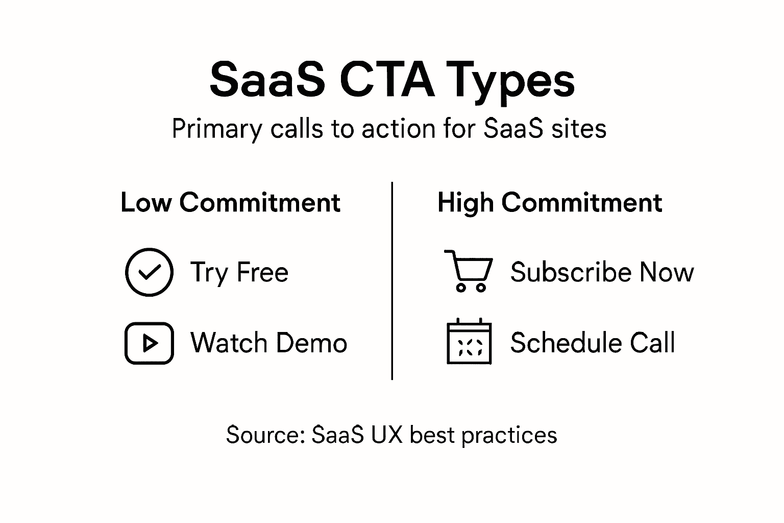
SaaS companies use different CTA types based on where the user stands. A cold visitor needs a low-commitment CTA. A warm prospect is ready for something stronger.
The Primary SaaS CTA Types
Most SaaS companies rely on these core CTA variations:
- Try for Free: Removes all risk, lets users experience your product immediately
- Get Started: Generic but powerful, works for visitors ready to commit
- Schedule a Demo: Ideal for enterprise deals, high-touch sales motions
- Request a Trial: Similar to free trial but implies a defined time period
- Subscribe Now: Direct path to payment, used for low-price products
- Watch a Demo: Low-barrier alternative when users aren’t ready for live interaction
SaaS CTAs leverage psychological triggers like urgency, scarcity, and social proof, and they differ in directness and user commitment level. Some focus on low-barrier entry while others drive direct conversion.
Here’s a summary of key SaaS CTA types, their business purpose, and typical conversion impact:
| CTA Type | Business Purpose | Typical Conversion Impact |
|---|---|---|
| Try for Free | Eliminates risk, builds user trust | Highest for cold visitors |
| Get Started | Promotes immediate action | Moderate for mid-funnel |
| Schedule Demo | Enables high-touch sales | Best for enterprise leads |
| Subscribe Now | Drives direct purchase | Strong for ready-to-buy users |
| Watch a Demo | Educates with minimal commitment | Good for top-of-funnel engagement |
Matching CTAs to User Readiness
Your first-time visitor to your website isn’t ready to “Subscribe Now.” They’re reading your homepage, comparing you to competitors, trying to understand what your product does.
That visitor needs “Try for Free” or “Watch a Demo.” These lower the activation energy. No credit card required. No 30-minute call scheduled. Just enough to answer the question: “Is this for me?”
Compare this to a visitor who came from your Google Ads campaign about your specific feature. They know what your product does. They’re evaluating whether it solves their problem. This visitor converts better with “Schedule a Demo” or “Get Started.”
Building Your CTA Stack
Don’t choose just one CTA type. Your SaaS needs multiple CTAs targeting different readiness levels.
Top-of-funnel CTAs (cold visitors):
- Try for Free
- Watch a Demo
- Download a Guide
Mid-funnel CTAs (warm prospects):
- Request a Trial
- Schedule a Demo
- Get Started
Bottom-funnel CTAs (ready to buy):
- Subscribe Now
- Complete Purchase
- Upgrade Plan
When writing content for SaaS websites, match your CTA type to what the page accomplishes. A feature comparison page earns “Get Started.” A product overview page earns “Try for Free.”
Context matters more than the CTA text itself. The same visitor converts at 12% with the right CTA in the right moment, and 2% with the wrong one.
Pro tip: Create a CTA matrix: list each page of your website (homepage, pricing, features, blog posts) and assign the right CTA type to each based on visitor readiness. Review this quarterly as your product and market position change.
Design Elements That Drive Engagement
Your CTA button is competing for attention on a crowded page. Visitors scan, don’t read. They glance at your homepage for 2-3 seconds before deciding to stay or leave. Your design elements determine whether that button catches their eye.
A poorly designed CTA gets ignored. A well-designed one pulls clicks even when the copy is mediocre. This is where psychology meets visual hierarchy.
To help optimize your CTA design, here’s a comparison of key CTA design elements and their effect on user engagement:
| Design Element | Effect on Engagement | Best Usage |
|---|---|---|
| High Contrast Color | Makes button stand out | Homepage and pricing pages |
| Strategic Placement | Matches user behavior | After value propositions |
| Adequate Size | Increases clickability | Above-the-fold and hero banners |
| Clear Whitespace | Reduces visual clutter | All pages for clarity |
| Subtle Animation | Draws attention discreetly | Onboarding and landing pages |
Color and Contrast Matter Most
Color psychology and size influence user response significantly. Your CTA button needs to pop off the page.
If your page has a white background and a gray button, users miss it. If your page is blue and your button is also blue, they miss it again. Your button needs high contrast against surrounding elements.
Consider these color strategies:
- Red: Creates urgency, works for limited-time offers or immediate action
- Green: Signals positive action, ideal for “Get Started” or “Try Free”
- Orange: High energy, draws eyes without red’s aggressive feel
- Dark colors on light backgrounds: Ensure 4.5:1 contrast ratio minimum for accessibility
Test different colors against your actual page design. What works for a SaaS onboarding flow differs from what works on a pricing page.
Size, Placement, and Whitespace
Your CTA needs strategic placement that matches user behavior. Most visitors scroll down your page. Your button should appear where they naturally pause.

On a homepage hero section, place your primary CTA in the upper right or center. On a feature-heavy page, repeat your CTA after explaining benefits. On a long-form article, place it mid-content and at the end.
Button size matters too. A button that’s 40 pixels tall gets 18% more clicks than one that’s 25 pixels. But oversizing wastes space and looks desperate.
Minimalist Design and Clarity
Minimalist design with clear value proposition reduces cognitive load. Users shouldn’t have to think about what happens when they click.
Your button text should be one action. “Start Free Trial” works. “Click here to learn more and get your free trial” overwhelms. Use clear, benefit-driven language.
Whitespace around your CTA prevents visual clutter. Give your button breathing room. This makes it feel intentional, not desperate.
Motion and Micro-Interactions
Subtle animation draws attention without overwhelming. A button that changes color on hover signals interactivity. A slight pulse on page load directs focus without being annoying.
Animation and micro-interactions draw attention without overwhelming users. But don’t auto-play videos or add spinning elements that distract from your core message.
When designing CTAs for better user engagement, every element should support the button’s visibility and clickability.
Design elements work together as a system. Color alone doesn’t guarantee clicks. Size alone doesn’t work. Combined strategically, they’re unstoppable.
Pro tip: Take a screenshot of your homepage and cover your CTA button with a gray rectangle. Can you tell where it should be? If not, your button isn’t visible enough. Increase contrast or size until it’s obvious.
Placement and Context Best Practices
Where your CTA lives matters as much as what it says. A “Subscribe Now” button above the fold converts differently than the same button at the bottom of a 2,000-word article. Context changes everything.
Your SaaS visitors are at different stages of understanding. Some need education before they’re ready to act. Others need a second chance to convert after scrolling past your first CTA.
Match Placement to User Journey Stage
Effective CTA placement considers the flow of user attention and where decisions naturally occur. You need multiple CTAs targeting different readiness levels.
Think about your visitor’s mental state at each section:
- Hero section: “Try Free” or “Watch Demo” (they’re just learning)
- After feature explanation: “Get Started” (they understand benefits)
- At pricing table: “Choose Plan” or “Subscribe” (they’re evaluating cost)
- Bottom of page: “Schedule Demo” (final chance to convert)
- Blog articles: “Start Free Trial” (side benefit, not main focus)
Repeat your CTA strategically. One button on a long page means most visitors miss it. Three buttons placed after key value props means multiple chances to convert.
Contextual Placement Strategies
Above-the-fold primary CTA works for cold traffic from ads. Your visitor landed here specifically. They need to act now or never.
Mid-content CTA appears after you’ve explained what your product does. Visitors who scrolled this far are genuinely interested. This CTA converts at 8-12% typically.
Sticky buttons stay visible as users scroll. They’re intrusive but effective, especially on mobile where scrolling is faster. Use sparingly and only for high-priority conversions.
**CTAs embedded with contextual cues reinforce value proposition. Don’t place your button in isolation. Surround it with benefit-focused copy: “Start your 14-day free trial. No credit card required. Cancel anytime.”
The Right Message for Each Context
Your homepage CTA differs from your feature page CTA. Your pricing page CTA differs from your blog post CTA.
On your homepage, visitors don’t know your product yet. “Try Free” works. On your pricing page, they know it well. “Subscribe Now” works.
On a blog article about SaaS metrics, “Start Free Trial” feels forced. Instead, use “See how [Feature] works” and link to a product demo. The context is educational, not sales-focused.
Mobile Placement Considerations
Mobile users scroll faster. They miss CTAs that work on desktop. Your above-the-fold button must appear within the first 300 pixels on mobile.
Sticky mobile buttons convert 15-20% higher than buttons that disappear on scroll. But test this against your audience. Some SaaS products see sticky buttons as annoying.
Context determines whether a CTA succeeds or fails. The right message in the wrong place converts at 2%. The same message in the right place converts at 12%.
Pro tip: Create a placement map for your entire website. List each page (homepage, pricing, features, blog) and write exactly where you’ll place your primary CTA and what that CTA will say. Match the CTA type to where the user sits in their buying journey.
Optimizing CTAs and Avoiding Pitfalls
You’ve designed a beautiful CTA button. You’ve placed it strategically. But if you skip testing, you’ll leave conversions on the table. Optimization isn’t a one-time project. It’s continuous refinement based on real visitor behavior.
The difference between a mediocre CTA and a high-performing one often comes down to small tweaks. A word change from “Learn More” to “See Pricing” can boost conversions by 30%. Testing reveals what actually works for your audience.
The Most Common CTA Mistakes
Most SaaS companies sabotage their own CTAs without realizing it. Avoid pitfalls like vague language, multiple conflicting CTAs, or unrealistic asks that cause disengagement.
Here’s what kills conversions:
- Too many CTAs: Five buttons on one page creates decision paralysis. Visitors freeze and leave
- Vague language: “Click here” tells users nothing. “Start your free 14-day trial” tells them exactly what happens
- Unrealistic asks: Asking for a phone number before a free trial signals high commitment. Most visitors bail
- Copy that doesn’t match the button: “Learn more” above a button that says “Subscribe now” confuses visitors
- Broken promises: Your CTA says “no credit card required” but your form demands payment info. Trust dies
Focus on One Clear CTA Per Moment
Optimization requires continuous A/B testing and focusing on a single, clear CTA per conversion moment. Your hero section has one primary CTA. Your pricing page has one primary CTA.
Secondary CTAs are okay. But they must support, not compete with, your primary button. If your page says “Get Started” in the hero and “Watch Demo” in the footer, visitors know the main path forward.
If your page says “Try Free,” “Schedule Demo,” “Watch a Video,” and “Read Case Study” everywhere, visitors don’t know what you want them to do.
The Testing Framework
Testing variants to understand what resonates with different segments significantly increases effectiveness. Start with these high-impact tests:
- Wording: Test “Get Started” vs. “Start Free Trial” vs. “Try Now”
- Color: Test your current color against 2-3 alternatives
- Placement: Test above-the-fold vs. mid-content vs. sticky
- Urgency language: Test “Start Now” vs. “Start Your Free Trial”
- Specificity: Test vague (“Learn More”) vs. specific (“Schedule 20-Minute Demo”)
Run each test for at least 2 weeks with 1,000+ visitors per variation. Small sample sizes produce unreliable results.
Build Trust Through Credibility Signals
Your CTA must deliver on its promise. If your button says “free trial,” users better not see a credit card form. If it says “schedule a demo,” they should reach a calendar app immediately.
Maintaining credibility and trust is critical. Add social proof near your CTA: “Join 5,000+ companies using [Product].” Include security badges for payment forms. Show testimonials near your trial CTA.
The best CTA isn’t the most clever. It’s the one that tells visitors exactly what happens next and keeps that promise.
Pro tip: Set up a simple spreadsheet tracking your top 5 CTAs. Record the button text, placement, conversion rate, and test date. Update it monthly. After 6 months, you’ll see patterns about what works. Use this data to optimize new CTAs faster.
Transform Your SaaS Conversions with Clear and Powerful Calls to Action
Struggling with vague or ineffective CTAs that leave your SaaS prospects confused or hesitant? The article “Effective Call to Action Boosting SaaS Conversions” highlights the crucial role of clarity, strategic placement, and personalized messaging in driving user action. If you want to avoid common pitfalls like decision paralysis and low engagement, you must create CTAs that remove uncertainty, create urgency, and align incentives clearly. These are exactly the principles we apply at WebSpider Solutions to help businesses like yours dominate their digital market.
Take control of your SaaS growth today. Our expert team specializes in crafting optimized digital marketing campaigns including SEO, paid advertising, and content marketing that increase targeted leads and amplify your calls to action. Ready to boost conversions with CTAs that truly resonate at every buyer’s journey stage? Visit our main landing page to request a free consultation and discover how our comprehensive strategies can transform your SaaS user engagement and drive measurable results now.
Frequently Asked Questions
What is a call to action (CTA) in the context of SaaS?
A call to action (CTA) is a direct request encouraging users to take a specific action, often leading them from interest to commitment, such as starting a free trial or scheduling a demo.
Why is the purpose of a CTA important for SaaS companies?
The purpose of a CTA is crucial as it communicates the value the user will receive when they take action. A clearly defined CTA helps potential customers understand what they can expect, thus improving conversion rates.
How can I make my CTA more effective?
To create an effective CTA, ensure it is specific, achievable, easy to follow, normative, and affirming. Providing clarity on what the user will gain and reducing ambiguity can significantly enhance engagement and conversion rates.
What are some common types of CTAs used by SaaS companies?
Common types of CTAs include ‘Try for Free’, ‘Get Started’, ‘Schedule a Demo’, ‘Request a Trial’, ‘Subscribe Now’, and ‘Watch a Demo’. Each type serves different purposes based on the user’s readiness level in the buyer journey.