


Struggling to maintain a seamless user experience for every customer—whether they visit from a phone in Brazil or a desktop in Germany—can make web design feel like chasing moving targets. The demand for responsive web design fundamentals is higher than ever, as flexible layouts and adaptive images help SaaS sites stand out on any device while boosting conversion. This article unpacks proven design principles that empower teams to create digital platforms ready for global user expectations.
Table of Contents
- Responsive Web Design Fundamentals Explained
- Key Techniques For Adaptive Web Experiences
- Effective Strategies For SaaS Product Sites
- Impact On Conversion, Retention, And SEO
- Common Implementation Pitfalls And Solutions
Key Takeaways
| Point | Details |
|---|---|
| Responsive Web Design | Emphasizes fluid grids, flexible images, and CSS media queries for adaptive layouts across devices. |
| Mobile-First Approach | Prioritizes small screen designs that progressively enhance for larger displays, ensuring critical content remains accessible. |
| User-Centric Design for SaaS | Focuses on clear value propositions and intuitive navigation to enhance conversion and retention rates. |
| Performance Impact | Responsive design boosts conversion rates and SEO through optimized user experiences across all devices. |
Responsive web design fundamentals explained
Responsive web design represents a powerful approach to creating flexible, adaptive websites that deliver seamless user experiences across multiple devices. At its core, responsive web design transforms how digital interfaces interact with different screen sizes and platforms, ensuring optimal readability and functionality.
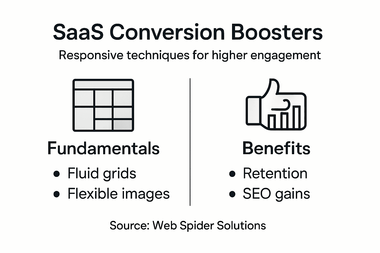
The fundamental principles of responsive design revolve around three key technical components:
- Fluid Grid Layouts: Dynamic grid systems that proportionally resize content
- Flexible Image Scaling: Media that automatically adjusts without losing quality
- CSS Media Queries: Conditional styling rules that trigger layout changes based on device characteristics
Responsive web design fundamentals represent a critical strategy for modern web development, enabling websites to automatically adapt to smartphones, tablets, desktops, and emerging screen technologies. This approach eliminates the need for separate mobile and desktop versions, streamlining design and maintenance processes.

Successful responsive design requires a mobile-first approach, which means designing initial layouts for smaller screens and progressively enhancing complexity for larger displays. This methodology ensures that core content and functionality remain accessible regardless of device limitations. Designers achieve this by using percentage-based measurements instead of fixed pixel dimensions, allowing content to flexibly resize and reflow across different screen resolutions.
Technical implementation involves several sophisticated techniques:
- Use relative units like percentages and ems instead of fixed pixels
- Implement flexible image and media settings
- Employ CSS flexbox and grid systems for dynamic layouts
- Test across multiple device sizes and orientations
Pro tip: Always prioritize content hierarchy and readability when designing responsive interfaces, ensuring critical information remains accessible across all device types.
Key techniques for adaptive web experiences
Adaptive web experiences represent a sophisticated approach to creating dynamic, personalized digital interfaces that respond intelligently to user behaviors and preferences. At the core of this strategy lies the ability to dynamically adjust content and design elements in real-time, ensuring maximum engagement and user satisfaction across different platforms and devices.
Technical strategies for creating adaptive web experiences include:
- Machine Learning Integration: Implementing AI-driven algorithms that analyze user interactions
- Contextual Content Personalization: Dynamically modifying interface elements based on user context
- Responsive Design Techniques: Flexible layouts that automatically adjust to different screen sizes and capabilities
AI-powered adaptive interfaces leverage sophisticated machine learning techniques to transform web interactions. These advanced methods enable websites to analyze user behavior, predict preferences, and automatically reconfigure content and design elements for optimal engagement.
The implementation of adaptive web experiences involves several key technical approaches. Multimodal data integration allows platforms to collect and analyze diverse user interaction signals, including browsing patterns, device characteristics, and historical engagement metrics. By employing techniques like collaborative filtering and natural language processing, web interfaces can create highly personalized and intuitive experiences that feel tailored to individual user needs.
Critical techniques for developing adaptive web experiences include:
- Implement machine learning algorithms for behavior prediction
- Design flexible, modular interface components
- Develop robust data collection and analysis frameworks
- Create personalization rules based on user segments
- Continuously refine adaptive strategies through iterative testing
Pro tip: Prioritize user privacy and transparency when implementing adaptive technologies, ensuring users understand and control how their data influences their web experience.
Here’s how responsive and adaptive strategies differ in web design:
| Approach | Adaptability Method | Complexity Level | Key Business Benefit |
|---|---|---|---|
| Responsive Design | Layout changes by device | Moderate | Broad device compatibility |
| Adaptive Experiences | Content adjusts to user | High | Personalized engagement |
| Static Design | No device adaptation | Low | Simpler maintenance |
Effective strategies for SaaS product sites
Successful SaaS product sites demand a strategic approach that combines intuitive design, seamless user experience, and compelling value proposition. User-centric design stands as the cornerstone of creating digital platforms that not only attract potential customers but also convert and retain them effectively across various digital touchpoints.
Key strategic elements for SaaS product sites include:
- Clear Value Proposition: Communicate unique benefits immediately
- Intuitive Navigation: Design user flows that minimize cognitive friction
- Performance Optimization: Ensure fast, responsive interface experiences
- Transparent Pricing: Display straightforward, easily comprehensible pricing models
Strategic management in SaaS design emphasizes creating product sites that prioritize user engagement through carefully crafted interface experiences. These platforms must balance aesthetic appeal with functional efficiency, ensuring that every interaction moves potential customers closer to conversion.
The implementation of effective SaaS product site strategies requires a multifaceted approach. Iterative design processes enable continuous improvement by collecting and analyzing user interaction data, allowing businesses to refine their digital experiences dynamically. This approach involves developing modular design systems that can adapt quickly to changing user needs and technological innovations, creating flexible interfaces that grow with user expectations.
Critical steps for developing high-converting SaaS product sites include:
- Conduct comprehensive user research
- Design clear, compelling landing pages
- Implement robust onboarding experiences
- Create interactive product demonstrations
- Develop targeted conversion pathways
Pro tip: Continuously monitor user behavior metrics and conduct regular usability testing to identify and eliminate potential friction points in your SaaS product site experience.
Impact on conversion, retention, and SEO
Responsive web design fundamentally transforms digital performance metrics by creating seamless, adaptive experiences that directly influence user engagement, conversion rates, and search engine visibility. Holistic performance optimization emerges as a critical strategy for businesses seeking to maximize their online potential across multiple digital channels.
Key performance dimensions influenced by responsive design include:
- Conversion Rate Enhancement: Reduce friction in user interactions
- User Retention Improvement: Create consistent experiences across devices
- Search Engine Ranking Boost: Improve mobile-friendliness signals
- Performance Speed Optimization: Reduce page load times
UX design impact on mobile retention demonstrates a direct correlation between intuitive interface design and significant improvements in user engagement metrics. Websites that prioritize seamless, adaptive experiences can experience substantial increases in conversion rates and sustained user interest.
The interconnected nature of conversion, retention, and SEO requires a comprehensive approach to digital design. Performance-driven interfaces leverage technical optimization techniques that simultaneously address user experience and search engine requirements. By creating responsive designs that adapt intelligently to different devices and user contexts, businesses can develop digital platforms that not only attract but also effectively convert and retain potential customers.
Strategic approaches for maximizing responsive design impact include:
- Implement adaptive layout technologies
- Optimize content for multiple device types
- Reduce page load complexity
- Create consistent navigation experiences
- Monitor and analyze cross-device performance metrics
Pro tip: Conduct regular performance audits using multiple devices to identify and eliminate potential user experience barriers across different screen sizes and platforms.
Common implementation pitfalls and solutions
Responsive web design implementation presents numerous challenges that can undermine user experience and overall digital performance. Technical complexity often creates unexpected obstacles that require strategic planning and sophisticated problem-solving approaches to successfully navigate and resolve.
Common responsive design implementation challenges include:
- Layout Inconsistency: Unpredictable rendering across different devices
- Performance Degradation: Slow loading times on mobile platforms
- Navigation Complexity: Difficult user interactions on smaller screens
- Content Scaling Issues: Inappropriate media and text display
Responsive design challenges in SaaS development reveal that systematic testing and proactive design strategies are crucial for mitigating potential technical complications. Understanding these challenges enables developers to create more robust and adaptable digital experiences.
Successful responsive design implementation demands a comprehensive approach that anticipates potential technical limitations. Progressive enhancement strategies provide a robust framework for developing interfaces that gracefully adapt to diverse technological environments. By designing with flexibility and user experience as primary considerations, businesses can create digital platforms that perform consistently across multiple devices and screen sizes.
Strategic solutions for addressing responsive design challenges include:
- Implement comprehensive cross-device testing protocols
- Use flexible grid systems and relative units
- Optimize image and media loading techniques
- Develop modular, scalable design components
- Continuously monitor and refine user interaction metrics
Pro tip: Develop a detailed testing matrix that covers multiple devices, browsers, and screen resolutions to systematically identify and resolve potential responsive design issues.
Below is a summary of common responsive design pitfalls and their potential solutions:
| Challenge | Impact | Solution Approach |
|---|---|---|
| Layout inconsistency | Confusing user experience | Implement thorough device testing |
| Performance degradation | Increased bounce rates | Optimize images and scripts |
| Navigation complexity | Frustrated mobile users | Streamline menu interactions |
| Content scaling issues | Poor readability | Use flexible units for sizing |
Elevate Your SaaS Conversions with Expert Responsive Web Design
The challenge of creating a responsive web design that boosts SaaS conversions lies in delivering seamless user experiences across all devices while maintaining clarity and performance. Many SaaS providers struggle with layout inconsistency, navigation complexity, and slow mobile performance that can frustrate potential customers and stall growth. This article emphasizes key pain points such as optimizing fluid grids, flexible images, and mobile-first strategies to increase user engagement and conversion rates.
At Web Spider Solutions, we understand how critical these elements are to your SaaS success. By integrating expert responsive design practices with targeted digital marketing, SEO, and performance optimization, we help your platform reach and convert the right audience effectively. Explore real-world strategies through our Stories Archives – Web Spider Solutions, stay ahead with insights from the Artificial Intelligence Archives – Web Spider Solutions, and discover how our tailored services at Web Spider Solutions transform your SaaS site into a conversion powerhouse.
Ready to eliminate roadblocks in your user experience and accelerate your SaaS growth? Visit us today and request your free consultation. Take action now to create a digital presence that converts consistently across every device.
Frequently Asked Questions
What is responsive web design?
Responsive web design is an approach to web development that ensures websites adapt seamlessly to various screen sizes and devices, providing optimal readability and functionality for users.
How does responsive design improve SaaS product conversions?
Responsive design enhances user experience by reducing friction, ensuring consistent performance across devices, and improving accessibility. This leads to higher engagement and increased conversion rates on SaaS product sites.
What are the key techniques for implementing responsive web design?
Key techniques include using fluid grid layouts, flexible image scaling, and CSS media queries to create adaptable and user-friendly interfaces that perform well on any device.
Why is a mobile-first approach important in responsive design?
A mobile-first approach prioritizes smaller screens during the design process, ensuring that essential content and functionality are accessible on mobile devices before progressively enhancing the experience for larger screens.