


Dark mode is quickly becoming more than a passing trend for SaaS platforms—it is a display approach that transforms the user experience by replacing bright interfaces with rich, dark backgrounds and illuminated text. Digital marketing managers who prioritize display theme personalization draw a clear line between a modern, accessible product and one that feels outdated. Adopting dark mode in your web design meets rising user expectations while directly impacting comfort, accessibility, and how your brand is perceived.
Table of Contents
- Defining Dark Mode Web Design Concepts
- Why Dark Mode Matters For SaaS Products
- Key Differences From Light Mode
- What Dark Mode Actually Includes
- Key Benefits For SaaS User Experience
- Reducing Eye Strain And Improving Comfort
- Extending Battery Life On Mobile Devices
- Improving Engagement And User Satisfaction
- Accessibility And Inclusive Design
- Creating Modern, Professional Perception
- Essential Accessibility And UX Guidelines
- Understanding Contrast Requirements
- Avoid Pure Black Backgrounds
- Color Selection Strategy
- User Control And Preference Persistence
- Testing Across Use Cases
- Design Best Practices And Implementation Tips
- Start With Wireframes And Fast Iteration
- Limit Your Color Palette
- Create Visual Depth With Lightness
- Design Component By Component
- Consider Your Brand Within Constraints
- Implement Accessibility Checks Throughout
- Common Mistakes And How To Avoid Them
- The Pure Black Background Problem
- Insufficient Contrast Ratios
- Over-Saturated Colors
- Missing User Customization Options
- Neglecting Accessibility Compliance
- Not Testing With Real Users
Key Takeaways
| Point | Details |
|---|---|
| Dark Mode Enhances User Experience | Offering dark mode reduces eye strain, improves focus, and matches user preferences, leading to greater satisfaction and retention. |
| Consider Accessibility | Ensure contrast ratios meet WCAG standards and provide customization options for users with visual sensitivities to create an inclusive experience. |
| Intentional Design is Crucial | Proper dark mode implementation requires careful calibration of colors, readability testing, and adjustments to maintain brand identity. |
| Track User Preferences | Monitor which users toggle dark mode to correlate their engagement with light mode users, informing future design decisions and improvements. |
Defining Dark Mode Web Design Concepts
Dark mode is more than just a trendy color scheme. It’s a display theme that flips the standard interface upside down, replacing bright backgrounds with dark ones and light text with dark text. This shift affects how users perceive, interact with, and feel about your SaaS platform.
At its core, dark mode displays light text on dark backgrounds instead of the traditional inverse. This simple reversal has profound implications for user experience, engagement, and how people use your product across different environments and times of day.
Why Dark Mode Matters for SaaS Products
For digital marketing managers overseeing SaaS platforms, dark mode isn’t cosmetic. Users now expect this option, and offering it demonstrates you understand modern design standards. Your competitors likely already have it.
Dark mode adoption continues to grow across industries. Users choose it for several reasons:
- Reduced eye strain during extended work sessions
- Lower energy consumption on OLED and AMOLED screens
- Personalization that matches user preferences and environments
- Improved focus in low-light conditions
- Modern, professional appearance that feels current
However, not all users benefit equally. User demographics and individual preferences significantly influence whether someone adopts dark mode. Age, lighting conditions, visual sensitivity, and personal aesthetics all play roles.
Key Differences from Light Mode
Dark mode isn’t simply inverting colors. It requires intentional design decisions that light mode doesn’t face. Understanding these differences helps your team implement dark mode properly.
The contrast requirements differ. Light text on dark backgrounds needs careful calibration to remain readable without causing visual fatigue. Your designers must consider color values, text weight, and spacing differently than in light mode.
Color psychology shifts too. Blues, purples, and cool tones feel different against dark backgrounds. Warm colors pop more aggressively. These psychological responses affect user perception of your brand and interface hierarchy.
Here’s a quick comparison between dark mode and light mode design challenges:
| Design Challenge | Dark Mode Approach | Light Mode Approach |
|---|---|---|
| Contrast Calibration | Precise text colors for readability | Standard contrast often sufficient |
| Color Psychology | Cool tones may feel muted, warm pop | Most colors behave as expected |
| Visual Hierarchy | Uses lightness gradients, subtle depth | Shadows and color serve hierarchy |
| Accessibility Concerns | Extra attention to low vision users | Accessibility typically easier |
What Dark Mode Actually Includes
Proper dark mode goes beyond switching backgrounds:
- Text colors adjusted for contrast and readability
- Accent colors selected for visibility against dark surfaces
- Component styling including buttons, form fields, and navigation
- Image handling to prevent stark white spaces that break the dark experience
- Transparency and shadows reimagined for the darker palette
- Icon adjustments to maintain visibility and brand consistency
Dark mode implementation requires systematic thinking across your entire interface, not just changing background colors and hoping text remains visible.
Your SaaS platform likely contains hundreds of interface elements. Each one responds differently to dark mode. Checkboxes, sliders, dropdowns, tooltips, and modals all need attention.
Pro tip: Start dark mode implementation by auditing your existing color palette and documenting which components appear in your interface most frequently—focus your effort there first.
Key Benefits for SaaS User Experience
Dark mode delivers tangible benefits that directly impact how your users experience and engage with your SaaS platform. These aren’t abstract design preferences—they’re measurable improvements that affect user satisfaction, retention, and productivity.
Reducing Eye Strain and Improving Comfort
Extended screen time is the reality for SaaS users. Your product managers, data analysts, and content specialists spend hours daily in your interface. Dark mode reduces blue light exposure and eye strain, especially during late-hour work sessions when ambient lighting diminishes.
When users work without constant glare, they report greater comfort. This matters more than you might think. Uncomfortable users leave platforms. They switch to competitors who prioritize their experience.
Low-light environments benefit most from dark mode. Evening work, night shifts, and dimly lit offices all present scenarios where dark mode shines. Your users control their own lighting conditions—dark mode adapts to theirs.
Extending Battery Life on Mobile Devices
Many SaaS users access your platform from mobile devices. Dark mode directly extends battery life on OLED and AMOLED screens by requiring less power to display dark pixels.

This matters for field teams, remote workers, and users checking dashboards between meetings. Longer battery life means users stay connected to your platform longer without searching for charging cables.
On smartphones with all-day usage patterns, this advantage compounds significantly over time.
Improving Engagement and User Satisfaction
Research shows that dark mode enhances user satisfaction when implemented correctly, particularly in productivity-focused applications. Users who prefer dark mode feel their preferences are acknowledged—that builds loyalty.
When you offer dark mode, you signal that user comfort matters to your company. This small feature communicates bigger values about your product philosophy.
Users who feel seen stay longer and engage deeper.
Accessibility and Inclusive Design
Dark mode isn’t just for gamers or night owls. It serves users with:
- Light sensitivity issues who struggle with bright interfaces
- Astigmatism where high contrast creates visual discomfort
- Migraines triggered by screen brightness
- Dyslexia where dark backgrounds improve text readability for some users
Offering dark mode demonstrates commitment to inclusive design, which appeals to socially conscious organizations evaluating your SaaS solution.
Creating Modern, Professional Perception
Your platform’s aesthetic affects how users perceive your company. Dark mode feels current, intentional, and professional. Users expect it in modern software.
Without dark mode, your interface risks feeling outdated compared to competitors, even if functionality is superior.
Dark mode is no longer a “nice to have”—users increasingly view it as table stakes for modern SaaS platforms.
The cumulative effect drives engagement metrics upward. Users who feel comfortable, respected, and modern are users who convert to paid plans and expand their usage.
Summary of business impacts of key dark mode features:
| Feature | User Benefit | Business Impact |
|---|---|---|
| Reduced Eye Strain | Enhanced daily comfort | Higher user retention |
| Battery Efficiency | Longer device usage | Increased session duration |
| Personalization | Adjustable appearance preferences | Greater customer satisfaction |
| Accessibility Options | Better for those with sensitivity | Wider user base, legal compliance |
Pro tip: Track which users toggle dark mode and correlate their engagement metrics against light mode users—you’ll likely discover higher session duration and feature adoption in your dark mode cohort.
Essential Accessibility and UX Guidelines
Dark mode implementation without proper guidelines creates more problems than it solves. Your users with visual impairments, color blindness, or light sensitivity need dark mode to work flawlessly. Getting it wrong excludes them entirely.
Understanding Contrast Requirements
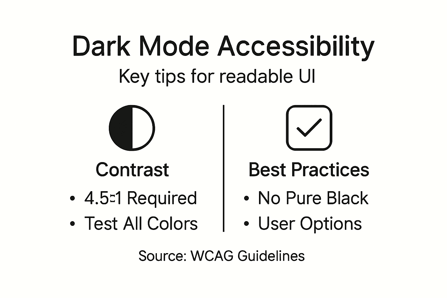
Contrast is the foundation of readable dark mode. Accessibility requires contrast ratios of at least 4.5:1 between text and background colors. This isn’t a suggestion—it’s the standard for WCAG AA compliance.
Your designers must test every color combination. White text on dark gray often fails. Dark gray on black definitely fails. Use contrast checking tools before pushing code to production.
For digital marketing managers, this means demanding your design team run accessibility audits before launch. Non-negotiable.
Avoid Pure Black Backgrounds
This seems counterintuitive for dark mode, but pure black (#000000) causes eye strain and haloing effects for many users. A softer, near-black shade like #121212 or #1a1a1a feels darker while reducing discomfort.
The difference is subtle but significant. Users notice it unconsciously through reduced fatigue over extended sessions.
Softer blacks also create better context for interface hierarchy using transparency and subtle shadows.
Color Selection Strategy
Not all colors work equally in dark mode. Avoid overly saturated colors and simulate depth with lightness variations rather than relying on brightness alone.
Design principles that apply:
- Desaturate accent colors slightly compared to light mode versions
- Use cooler hues for backgrounds to reduce perceived brightness
- Apply lighter shades of your brand colors for emphasis
- Test with color-blind simulators to catch red-green issues
- Maintain your brand while adapting to dark constraints
Brand colors designed for light backgrounds often need adjustment. Your primary blue might need lightening. Your orange accent might need toning down. Plan this adjustment early.
User Control and Preference Persistence
One-size-fits-all dark mode fails. Some users prefer pure black. Others want gray. Some want higher contrast. Your platform should let users customize darkness levels and color intensity.
Store these preferences in user accounts so they persist across devices and sessions. Nothing frustrates users more than resetting preferences every time they log in.
Auto-detection of system dark mode is smart, but manual override is essential.
Testing Across Use Cases
Accessibility testing matters most for your actual users. Conduct testing with:
- Users with low vision who use magnification
- Color-blind users across all types
- Users with light sensitivity and migraines
- Screen reader users (dark mode shouldn’t affect audio output)
Proper dark mode accessibility means users with disabilities get the same experience as everyone else, not a degraded alternative.
Your SaaS platform serves productivity professionals. Make dark mode work perfectly for them, and you gain competitive advantage.
Pro tip: Use the WebAIM contrast checker to validate every text-background combination before design sign-off, testing both normal and large text sizes separately.
Design Best Practices and Implementation Tips
Implementing dark mode successfully requires a systematic approach, not random color swapping. Your design team needs clear principles and a tested methodology to convert your interface efficiently while maintaining quality and usability.
Start with Wireframes and Fast Iteration
Don’t jump straight to high-fidelity mockups. Use wireframes first to test dark mode principles at scale. This lets your designers see how layout, spacing, and hierarchy work in dark before investing time in detailed visual design.
Wireframes also accelerate feedback cycles. Your stakeholders can react to structure without getting distracted by color debates.
Iterate quickly using grayscale or limited color palettes initially. Add visual refinement once structure proves solid.
Limit Your Color Palette
A focused design method for dark mode starts with limiting color palettes and desaturating colors compared to light mode. This constraint forces intentional choices and prevents chaotic visual hierarchy.
Target a palette of 5-8 core colors maximum. Each color serves a specific purpose:
- Neutrals for backgrounds and text (3-4 shades)
- Primary accent for main actions and emphasis
- Secondary accent for supporting actions
- Semantic colors for success, warning, error states
- Optional tertiary for advanced features
Don’t try to preserve your exact light mode palette. Dark mode needs its own color story.
Create Visual Depth with Lightness
Instead of using size or shadows alone, use lightness variations to create depth in dark UI and establish visual hierarchy. Slightly lighter backgrounds for elevated surfaces, darker backgrounds for recessed areas.
This technique is counterintuitive for designers trained on light mode shadows. Practice thinking in layers of darkness rather than layers of shadow.
A card elevated above its container should be slightly lighter. A disabled state should be darker. Lightness becomes your primary depth tool.
Design Component by Component
Don’t redesign your entire interface at once. Break work into components and test each systematically:
- Text inputs and form fields
- Buttons and interactive elements
- Cards and containers
- Navigation and menus
- Data tables and lists
- Modals and overlays
- Status indicators and badges
Test each component for readability, contrast, and visual clarity before moving forward. Catch issues early when fixes are cheaper.
Consider Your Brand Within Constraints
Your brand colors exist in a light mode context. They need adjustment for dark mode without losing recognizability. This requires intentional redesign, not just darkening hex codes.
Your primary blue might lighten 10-20%. Your accent orange might shift toward a warmer, less saturated tone. Your brand team needs involvement in these decisions.
Dark mode isn’t about abandoning your brand identity—it’s about translating it into a different visual language.
Document your dark mode color variations explicitly. Create a dark mode brand guide that shows every approved color alongside its light mode counterpart.
Implement Accessibility Checks Throughout
Test contrast ratios during implementation, not after. Use automated tools in your design software to flag contrast failures immediately. Don’t let poor contrast pass code review.
Test with actual users who have visual impairments or color blindness. Automated checkers miss real-world usability problems.
Pro tip: Build dark mode as a configurable theme in your design system from day one—this prevents maintenance nightmares later when brands, components, or accessibility standards change.
Common Mistakes and How to Avoid Them
Dark mode projects fail when teams skip planning and jump into execution. Understanding where things go wrong helps you avoid expensive redesigns and frustrated users.
The Pure Black Background Problem
Using pure black backgrounds causes eye strain and haloing effects that negate dark mode benefits. Your users end up more uncomfortable, not less. This is the single most common mistake.
Pure black (#000000) is visually jarring against lighter UI elements. Switch to dark gray (#121212, #1a1a1a, or #0f0f0f) and watch user comfort improve immediately.
Test this yourself. Spend an hour in pure black dark mode, then switch to dark gray. You’ll feel the difference in eye fatigue within minutes.
Insufficient Contrast Ratios
Low contrast text is readable on your monitor in good lighting. It’s unreadable for your users in different conditions. Poor contrast between text and background affects readability and excludes users with visual impairments entirely.
Your designers must test every color combination against WCAG AA standards (4.5:1 minimum). Don’t assume light gray text on dark backgrounds works. Test it.
Automated checkers catch obvious failures. Real user testing catches subtle problems that fail in specific lighting or at specific viewing angles.
Over-Saturated Colors
Bright, highly saturated colors look aggressive in dark mode. They assault the eye. Your accent colors need desaturation compared to light mode versions.
Your vibrant orange becomes a muted burnt orange. Your electric blue becomes a softer, warmer blue. This adjustment takes intention. Most teams skip it and regret it.
Missing User Customization Options
One-size-fits-all dark mode frustrates users with different preferences. Some need pure black. Others want gray. Some need adjustable contrast levels. Lack of user customization options limits dark mode effectiveness and reduces adoption.
Offer these options:
- Toggle between light and dark modes
- Darkness level adjustment (if feasible)
- High contrast variant for accessibility needs
- Follow system preferences automatically
- Remember user choice across sessions
Preference persistence matters tremendously. Users resetting their choice every login become frustrated and disable dark mode.
Neglecting Accessibility Compliance
Dark mode implementation that ignores accessibility guidelines essentially breaks your platform for disabled users. Insufficient contrast, poor color choices, and lack of testing create barriers these users can’t overcome.
Accessibility isn’t optional. It’s not a nice feature. It’s a legal and ethical requirement that your design team must understand and respect.
Dark mode mistakes compound over time—poor contrast decisions made in design become impossible to fix after launch without major rework.
Not Testing with Real Users
Automated tools catch 60% of problems. The other 40% require testing with actual users, especially those with visual impairments, color blindness, or light sensitivity.
When you skip user testing, you ship blind. Your team thinks everything looks fine because you’ve never experienced the interface the way your users experience it.
Pro tip: Create a dark mode checklist and run it before every code deployment: contrast verification, pure black audit, saturation review, user preference persistence test, and accessibility compliance check.
Transform Your SaaS User Experience with Expert Dark Mode Design
Dark mode is reshaping how users engage with SaaS platforms by reducing eye strain, enhancing accessibility, and creating a sleek, modern interface. As the article highlights, delivering a seamless dark mode experience requires careful attention to contrast, color psychology, and user customization to keep users comfortable and loyal. Many SaaS products struggle with inconsistent dark themes and poor accessibility that drive user frustration and limit growth.
At WebSpider Solutions, we understand the critical challenge of implementing dark mode that truly enhances user experience and keeps your platform competitive. Our expert web design and development teams specialize in creating visually stunning, accessible interfaces tailored to your brand identity and user needs. Combined with our strategic SEO and content marketing services, we help you amplify your SaaS product’s reach while ensuring your users stay engaged for longer.
Ensure your SaaS platform delivers the dark mode experience your users expect. Discover how our comprehensive digital marketing and design solutions can elevate your user interface and boost engagement now. Visit Web Design & Development Services to start your transformation and request a free consultation at WebSpider Solutions. Act today to stay ahead in the evolving digital landscape.
Frequently Asked Questions
What is dark mode in web design?
Dark mode is a display theme that replaces bright backgrounds with dark ones and light text with dark text, enhancing user experience and comfort, particularly in low-light conditions.
Why should SaaS platforms consider implementing dark mode?
Implementing dark mode helps reduce eye strain, improve user comfort, extend battery life on mobile devices, and align with modern design expectations, enhancing overall engagement and user satisfaction.
How does dark mode compare to light mode in terms of user experience?
Dark mode requires careful contrast calibration and color selection to ensure readability and visual comfort, while light mode typically meets standard contrast expectations, making dark mode implementation more complex yet impactful for certain users.
What are the accessibility considerations for dark mode design?
Accessibility in dark mode includes ensuring sufficient contrast ratios, avoiding pure black backgrounds, and offering user customization options to accommodate various visual impairments and light sensitivities.